Wiktor Buksza

The Notus TIMES

Notus Collection: 3 Optical Sizes, 5 Styles, Latin & Cyrillic
Architectural, Classical, Elegant, Fluid, High-Contrast, Neoclassical, Kinetic, Sculptural, Universal

Silent rhythm,
tactile grace.

Active Style: Notus Display Regular

Named after the ancient deity of the southern gale, Notus dissolves the cold severity of neoclassical letterforms with fluid, kinetic terminations. Engineered for monumental presence in editorial headlines and crystalline legibility in prolonged text.

NOTUS DISPLAY REGULAR 120 PT
Metamorphosis
NOTUS DISPLAY REGULAR 64 PT
Can discipline
learn to flow?
NOTUS TEXT REGULAR 24 PT
Marble pillars, Southern gale, Kinetic silence, Amber light, Crystalline punctuation, Neoclassical balance, Fluid drops, Architectural grandeur, Slavic cadence.
NOTUS DISPLAY ITALIC 120 PT
Metamorphosis
NOTUS DISPLAY ITALIC 64 PT
Где геометрия
обретает голос?
NOTUS TEXT ITALIC 24 PT
Тёплый полуденный бриз, Кинематографическая антиква, Текучие капли засечек, Роскошь контраста, Аутентичная кириллица, Римский канон, Золотое сечение 1892 § 2026.
Manifesto EDITORIAL BROADSHEET
KINETIC GEOMETRY
Architectural, Human
Monumental, Tempestuous, Radiant, Fluid, Architectural, Nuanced, Sovereign, Resonant, Authentic

In ancient Mediterranean mythology, Notus was the south wind — a sudden, tempestuous gale that carried warm air across the Aegean, thawing the frozen stillness of the north. In contemporary typography, Notus embodies that very transformation: neoclassical serif architecture softened by fluid, calligraphic grace.

Where orthodox high-contrast serifs remain brittle and distant, Notus breathes. Its terminal endings do not terminate abruptly in razor-sharp brackets; they curve into liquid, organic drops that catch the light and gently steer the reading cadence across three dedicated optical masters: Display, Text, and Caption.

Особое внимание в гарнитуре уделено кириллической системе знаков. Созданная дизайнером-носителем языка, кириллица Notus избавлена от механических заимствований из латинских форм. Строение знаков «Ж», «б», «ф», «я» и «ц» следует собственной исторической логике пера и пластики штриха.

Это делает Notus редким явлением в современной типографике: шрифтом с подлинной двуязычной душой, одинаково убедительным как в монументальном заголовке издания, так и в плотном тексте литературного журнала. Поддерживает капитель, минускульные цифры и полные лигатуры.

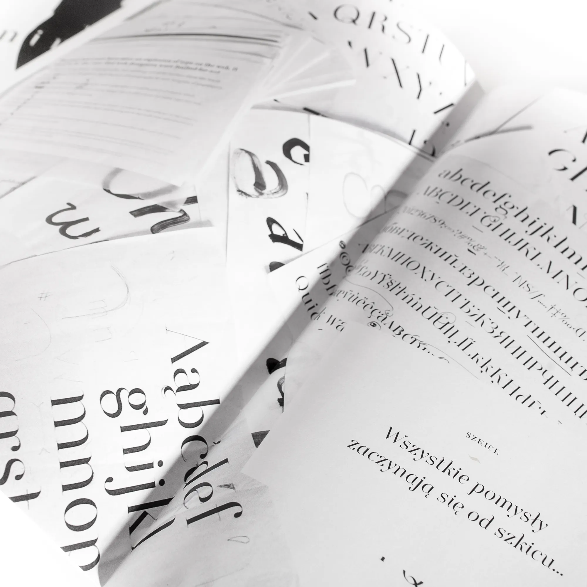
AaBbCcDdEeFfGgHhIiJjKkLlMmNnOoPpQqRrSsTtUuVvWwXxYyZz
АаБбВвГгДдЕеЁёЖжЗзИиЙйКкЛлМмНнОоПпРрСсТтУуФфХхЦцЧчШшЩщЪъЫыЬьЭэЮюЯя
1234567890 · $ € £ ¥ ₽ § ¶ © ®
notus
Architecture, Breeze, Cadence, Discipline, Equilibrium, Fluidity, Geometry, Horizon, Intuition, Juxtaposition, Kinetic, Liquid, Marble, Notus, Optical, Poetry, Quartz, Rhythm, Sculpture, Terminals, Unspoken, Velocity, Warmth, X-height, Yearning, Zephyr 42:15:01
Optics OPTICAL SIZE COMPARISON
OPTICAL SIZE 01 42 PT AND ABOVE
Display
Extreme 1:12 contrast, gossamer hairlines, and theatrical drama for posters and covers.
OPTICAL SIZE 02 12 PT TO 24 PT
Text
Tempered contrast, reinforced brackets, and rhythmic counters for effortless long-form reading.
01

Families & Optical Hierarchy

Five meticulously engineered styles spanning three dedicated optical masters.
Scale All Styles: 54px
Display Regular 42pt+
The architecture of stillness softened by southern wind.
Display Italic 42pt+
Rapid calligraphic cadence sweeping through classical space.
Text Regular 12–24pt
Crystalline ink balance and steady cadence for prolonged reading.
Text Italic 12–24pt
Warm, articulate slant accompanying running thoughts with grace.
Caption Regular 6–10pt
Open apertures and fortified serifs remaining legible at 6pt.
02

Interactive Tester

Type your custom copy, calibrate size, leading, tracking, and optical styles in real time.
Style
Format
Canvas
Size 64px
Leading 1.15
Tracking 0.00em
Pangram Presets:
Notus brings the warmth of southern gales into rigid typographic stone.
Selected Style: Notus Display Regular
Character Count: 68 chars
03

Character Set & Glyph Matrix

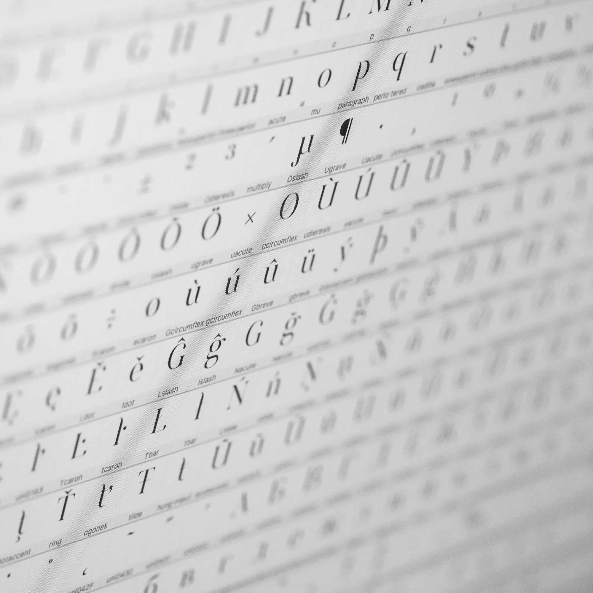
480+ characters. Hover over any glyph to magnify on the left; click to copy to clipboard.
Glyph Inspector
a
LATIN SMALL LETTER A
U+0061 · Dec 97
04

OpenType Features & Specifications

Test OpenType feature substitutions live.
THE ARCHITECTURE OF BREATH 1892–2026. RATIO ½ TO ¾. (SECTION § 48 · LATIN & CYRILLIC).
Typeface Notus
Designer Wiktor Buksza
Optical Masters Display, Text, Caption
Supported Scripts Latin Extended, Cyrillic
Formats OTF, TTF, WOFF, WOFF2